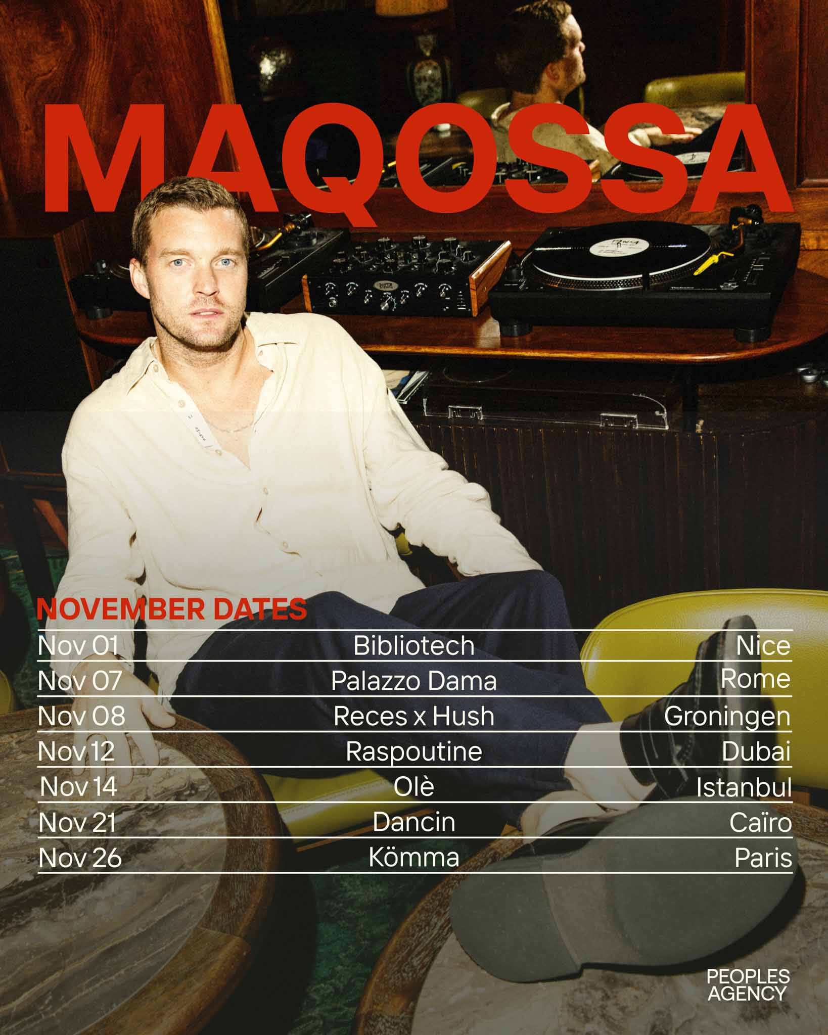
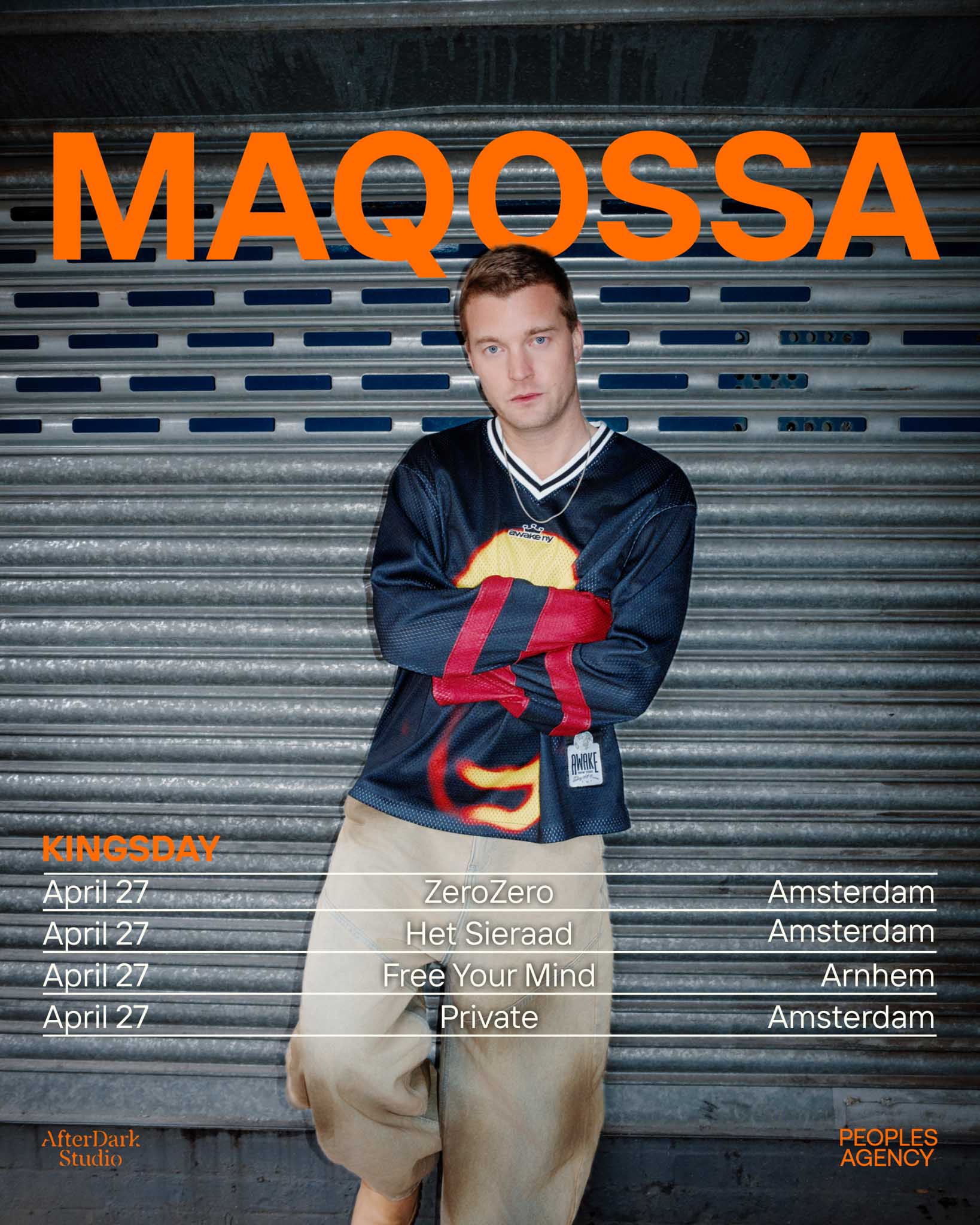
For Maqossa, we developed a series of artworks built from a defined visual language, ensuring consistency across different releases, events and visual outputs.
We developed a series of artworks based on the visual direction established during the press kit shoot.
Using the same visual language, we created consistent designs that can be applied across different tours, events and releases. Typography, color and composition were kept aligned to ensure recognizability over time.
From shoot to artwork, every element is connected within one cohesive identity.
.jpg)

Sign up to hear about new projects, updates, and what we’re working on behind the scenes. No spam, no weird stuff - just the good stuff, straight from us to you.
